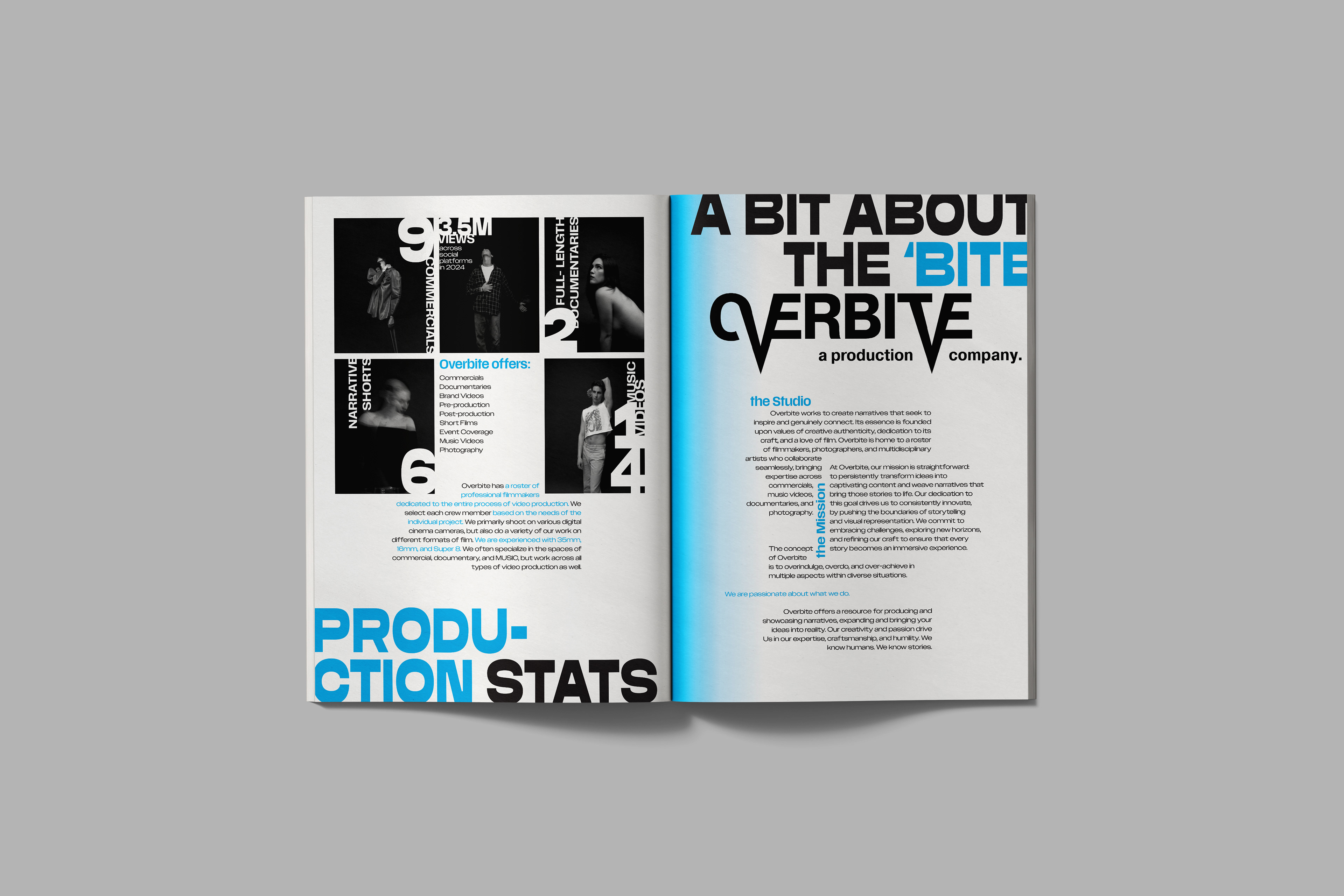
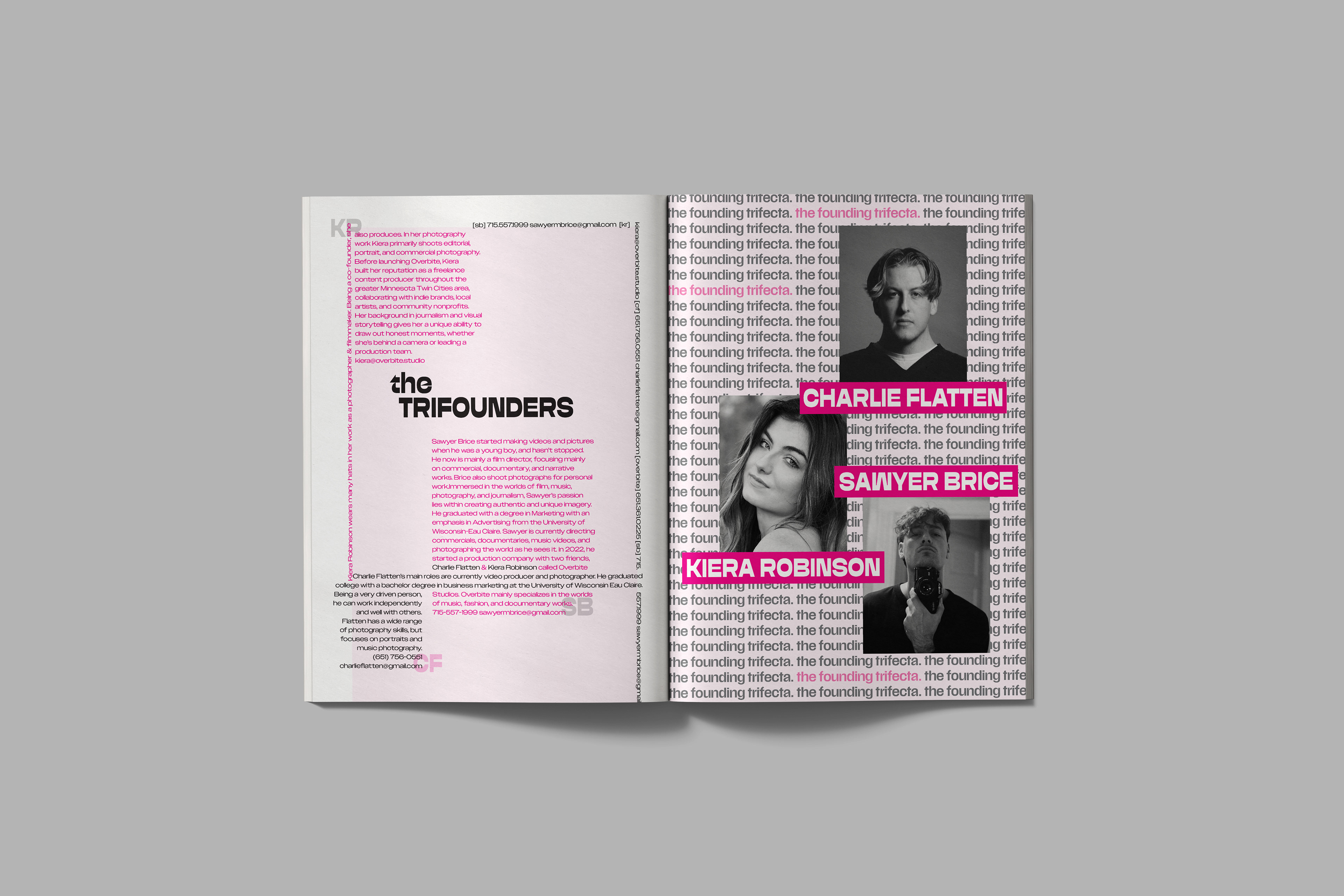
Overbite magazine is a brand extension for the production company, Overbite.
Starting with a clean logo redesign, the magazine spreads raw designs push the boundaries between editorial luxury and daring street aesthetics. Experimenting with typography, CMYK color, and unconventional layouts.
Starting with a clean logo redesign, the magazine spreads raw designs push the boundaries between editorial luxury and daring street aesthetics. Experimenting with typography, CMYK color, and unconventional layouts.
Objective
Create a brand extension in the form of a print & digital magazine for the production company, Overbite. Build on the existing identity, using brand guidelines to design a fresh logo.
Design Goal
Create an experimental, typography-driven identity that extends Overbite production company's brand into a daring, print publication. Blur the boundaries between street aesthetics and editorial design in feature magazine spreads using a CMYK color palette.
A magazine brand extension for the production company Overbite, with a fresh new logo.
